There’s one thing I’ve noticed: The more pictures I take, the better they get.
Sure, this is partially because I’ve upgraded iPhones, trading in my ‘antique’ iPhone 5S for an iPhone 8 Plus. This latter version features iPhone camera’s Portrait mode, which is a complete game-changer when it comes to taking friends' headshots or even wildflower close-ups.
But it’s also because I've gotten more adept at recognizing how light can change a subject, what colors complement others, and really, what makes a good photo.
I've spent much of this past year taking iPhone photos of random objects, such as the flowers blooming in the park outside my San Francisco apartment. The city's Victorian architecture. Street art from the Mission neighborhood to Chinatown.
Here are some tips beyond the more commonplace ones on ways to make your own images worthy of bragging about, even before editing. It's when the real magic happens.
Don't be afraid of empty space
Italian art critic Mario Praz used the term horror vacui, or the fear of empty space, to describe the endless embellishments of the Victorian era, such as gingerbread trim on houses and parlors brimming with antiques and doilies.
It made it as though your eyes didn’t know where to look.
Don’t do this with your photos.
Empty or “negative” space—meaning a space that’s void of imagery—in a picture can be just as important as its positive space. Even if the positive space is what you’re actually photographing, aka the main subject, and also what draws the eyes.
In fact, when done right, negative space helps define the subject and makes it the photo’s focal point. Try ‘centering’ the photo’s main image in the corner of a shot, or off to the side, or against say, a cloudless blue sky.
For example, take this pic of a severely trimmed tree in San Francisco’s Golden Gate Park:

Embrace the empty space. (Laura Kiniry / Map Happy)
Both the positive and negative space work together to make the tree really stand out. There’s also no question as to the image’s main star.
To portrait or landscape?
Portrait mode blurs the background of a pic, adding a “depth of field” that gives way more prominence to the photo’s main subject. The feature works so well, it often looks like you used a digital single-lens reflex (DSLR) camera to take the photos.
On days I’m exploring solo, I use portrait mode to take photos of flowers, like a recent bloom on this magnolia tree.

Portrait mode. (Laura Kiniry / Map Happy)
For those lucky enough to have it, iPhone’s portrait mode isn’t a full-on miracle-worker.
One of the reasons this particular image works is, despite the blurry background, the colors and scenery still contribute to the photo. They make the flower stand out.
Though, when it comes to iPhone landscape photography, there’s no set mode on most iPhones (the iPhone 11 and iPhone 11 Pro do have an awesome new wide-angle lens perfect for this).
However, both iPhones and Androids have Grid, which can be turned on in Settings if it's not already active. Grid can help with one of the most important factors in landscape photography: Getting the horizon line straight. A good photographer can spot a crooked horizon line a mile away.
They’ll also be sure to point it out.
For social media, Facebook and even blogs thrive on horizontal pics. They just look better on the page, though video is kinda of a portrait thing.
Other things to consider: leading lines, which draw the eye to a specific area of a photo. It’s almost as though they’re telling your viewer a story by directing them where to look. Also, killer skies. Trite, but effective.
This image of a street view in San Francisco has both:
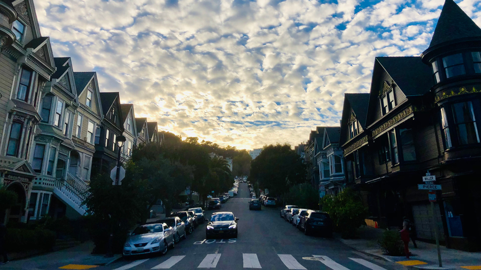
Streets of San Francisco. (Laura Kiniry / Map Happy)
Be sure to keep in mind that no matter the orientation (landscape, portrait, or otherwise), avoid direct lighting on the subject at all costs.
Not only does it cause unfavorable shadows and add harsh lines, but if you’re taking a photo of a person, it can make them look 10 years older. Seriously, hasn’t this past year aged us enough?
Look for complimentary colors
By simple definition, complimentary colors are hues that are opposite from each other on the color wheel, such as red/green, yellow/purple, orange/blue and the myriad of shades in between.
Using complimentary colors together in a photo can really make an image ‘pop.’ This technique also brings out the vibrancy of each stand alone hue.
For instance, iPhone photographer Julie Gebhardt makes great use of complimentary colors, whether it's pairing an orange house with a blue sky or green doors with pink staircases.
Another expert in the field is Austin-based iPhone photographer Jack Hollingsworth (his iPhone portraits are outstanding). He’s a pro at pairing color, shape, and texture, as well as using warm (reds, yellows, oranges) and cool (greens, blues, purples) color schemes to evoke emotions. For example, the intensity of red flora or the subtle softness of coiled blue rope.
PRO TIP: Find a background with a strong color, like an orange wall or green field, and then practice photographing it with objects of contrasting color. For instance, a baby blue bicycle or a red sweater.
Then seek out warm and cool color schemes and see how the images make you feel. Excited? Energetic? Calm?
Use the tools
PRO TIP: For Android users, the camera also has a similar feature called Portrait. Go figure!
Is your camera constantly focusing on a friend’s face when what you’re really trying to highlight the cocktail they’re holding? Simply tap the screen where you want the focus to be and a yellow box will appear. Keep your finger there for a couple more seconds and “AE/AF Lock” will appear at the screen top. This means you’ve locked in the focus, essentially performing a manual override.
The iPhone camera also has something called High Dynamic Range (HDR). Use this to even out the lighting when you’re shooting something that has a lot of contrast, such as light pouring through a shadowy entryway.
By enabling HDR, this allows the camera to capture images at different exposures (light balance) and then blends them together for the best shot.
When it comes to the camera’s zoom feature, it is best not to use it unless it is an optical zoom. This is because most mobile phones use something called “digital zoom,” which employs built-in software to increase an image’s size by simply cropping away the outlying parts, but does not increase quality.
The end result: photos that are pixelated and fuzzy.
There is an exception to this: a newer iPhone (iPhone 8 Plus and up) camera’s 2x feature, which is activated by tapping the 1x that shows up on the screen when you’re going to shoot a pic. It’s actually a pre-set “optical zoom,” which means it uses a magnifying lens instead of software. For closer shots, it’s a good way to go.
Though there’s an even better option: physically moving up a few feet.
Trust yourself
According to Hollingsworth, the most important tool in photography isn’t the camera, lens, technique, or location. It’s the eyes.
“Not just learning how to see,” he says, “but being able to translate and apply that sense of deep sight, frame after frame, with the same results.”If you think it’s photoworthy, snap a pic.
Then keep doing it. Again and again and again, until you’re happy with the results. Eventually, there might even be something to hang on the walls.